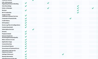
Misc
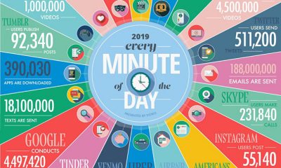
Visualizing World’s Data Usage [Infographic]
Published on
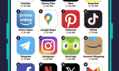
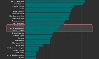
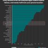
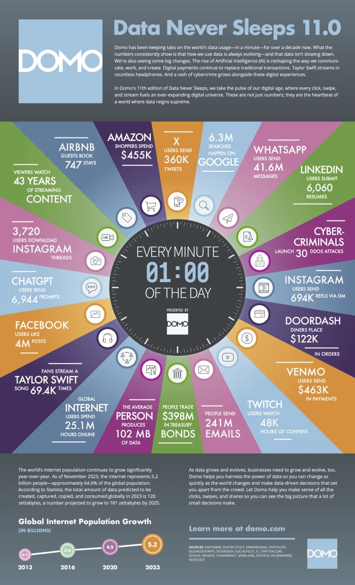
It is no secret that people around the world create and consume a ton of data on a daily basis. Some of us can’t even understand the magnitude without looking at hard data. This visual from Domo visualizes the world’s data usage:
✔️ InVideo: Create Videos with AI Text Prompts
***Disclaimer: Our articles may contain affiliate links. Please read our disclaimer on how we fund this site. As an Amazon Associate, we earn from qualifying purchases.


![10 Cat Superpower [Infographic]](https://www.best-infographics.com/wp-content/uploads/2022/04/07/10-Cat-Superpower-scaled-400x200.jpg)